Sam Stone unpacks the importance of finding distinctiveness through simplicity
FMCG brands, like those in fashion, perfumes, accessories and more, live in a world of dupes. And in a world where #dupe culture has around six billion TikTok views and 11 percent of UK consumers admit to buying faux products once every few months, brands need to increasingly protect themselves by making copycats’ lives as hard as possible.
This means FMCG brands, now more than ever before, need to work out and focus on what makes them truly distinctive and embrace the power of bold, stripped-back design to cut through the noise. But simplicity doesn’t necessarily mean minimalism. Instead of throwing away the most recognisable elements of their visual identity, brands should embrace the assets that are fundamental in creating their personality.
‘Simplify to amplify’ is an approach which prioritises clarity and impact to elevate brand personality. But in a simplified approach, there are fewer elements on hand to establish a unique identity. FMCG brands therefore need to understand how to bring their sense of self to the shelf and anchor to an unordinary idea to reinforce a strong identity with stronger visual assets.
Creating a distinctive ethos
FMCG brands need to be clear in what they stand for and reflect this with their visual identity. The more distinctive a brand, the more it protects itself from the rising threat of dupe products by connecting customers beyond the functional aspects of your offering.
For many, this could be an exercise in removing the clutter and identifying a handful of the assets that clearly communicate their personality. There is no one-size-fits-all approach. For any FMCG brand, this could be a selection of movement, shape, sound or tactility – anything that contributes towards a distinctive expression of the brand’s personality that others cannot easily copy.
For example, Tropicana’s recent decision to switch from its iconic carafe-shaped bottle to a generic-shaped plastic bottle, leaves us wondering whether it might weaken the perceived value of the product itself when price-discerning shoppers compare that to another cheaper alternative juice.
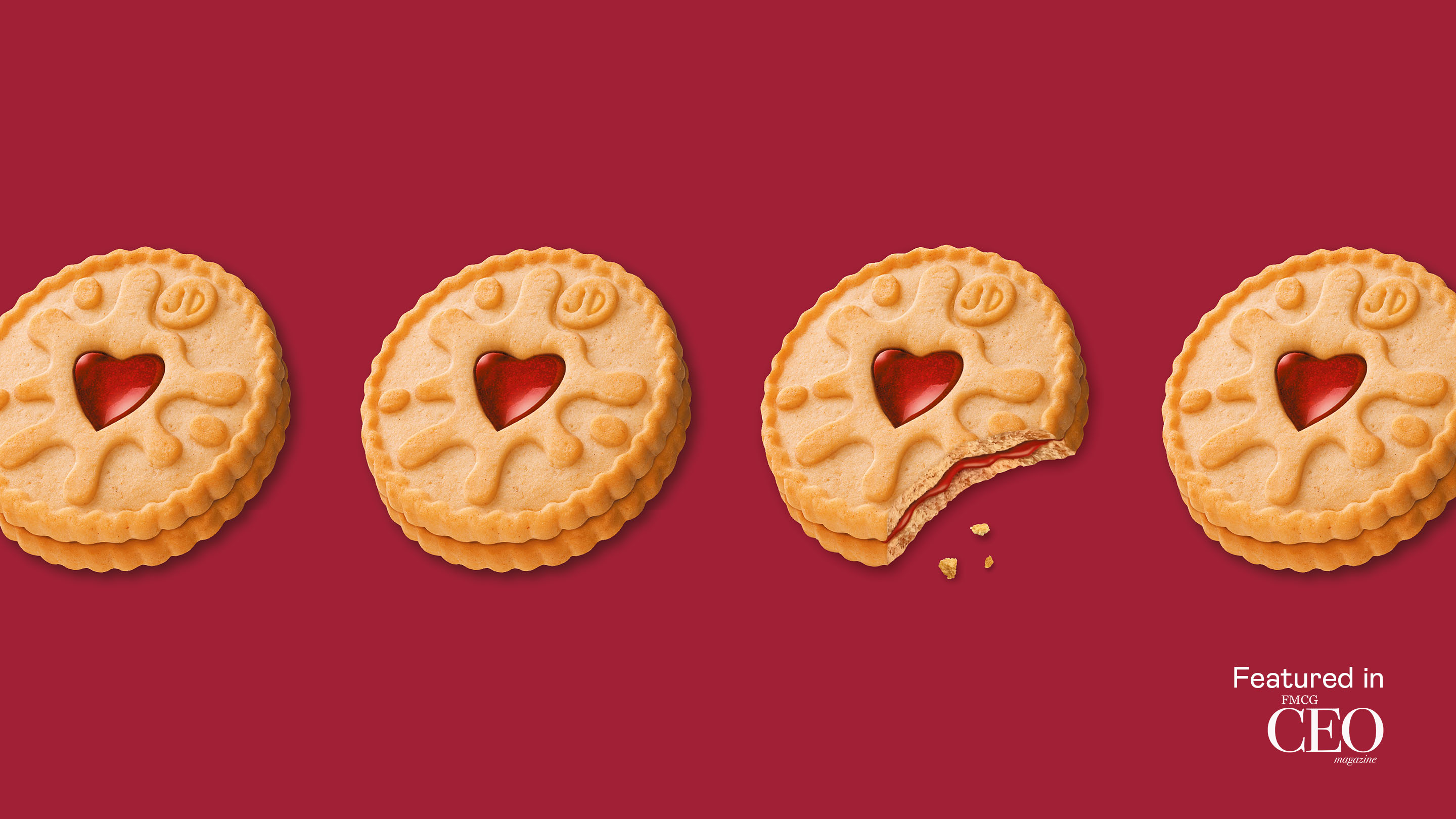
We recently worked with iconic British biscuit brand, Jammie Dodgers, to create and bring to life the brand idea ‘Cheeky at Heart’. Our packaging re-stage unearthed and amplified the brand’s most iconic features, rooted in memory and culture such as the love heart, the jam splat and a pleasantly mischievous character, and made them inimitable brand hallmarks.
We made the jam ‘jammier’ and the splat ‘splattier’ with the playfulness of the product front and centre. By simplifying the visual identity, embracing the unordinary aspects of the product and removing irrelevant assets, we ensured the ‘Cheeky at Heart’ personality clearly cut through.
Sometimes it is the simplest things about a brand or its product that make it the most unique. The more a brand connects this aspect with its design thinking, the stronger the story and distinctiveness is.
Understanding how to get rid of the clutter
A New Year clear out to say goodbye to the clutter is easier said than done. But the approach can be simple – keep, throw, or evolve. There is just one question brands need to ask when assessing various aspects of their identity: does this relate to the brand’s idea? If the answer is no, then it is time to say goodbye or identify how to enhance the asset to turn the answer into a yes.
While clearing the clutter, it’s important to retain a brand’s core personality and idea to ensure it continues to resonate. When Pizza Express rebranded its at-home range, it waved goodbye to the elements that didn’t align with its brand idea anchored to creativity and flair. By amplifying its most distinctive visual asset, the original Pizza Express restaurant logo scaled up on the pack created a bolder impact in a sea of sameness on the shelf.
Toblerone’s revamped identity, by Bulletproof, anchors itself to the brand’s long tradition of being different in a world filled with square chocolates. You can see and feel how the ‘Be More Triangle’ idea fuelled the team behind the rebrand and how easy it was for them to be inspired to come up with a wealth of creative solutions.
Letting creativity thrive
There are two types of creative briefs – a prescriptive one with a set criteria around colours, shapes, typography and other elements of the brand, or an expressive one, which ensures greater creative freedom by allowing feelings and interpretations that get to a richer execution of the brand’s personality and idea.
For example, when working with Jammie Dodgers, we briefed creative and lettering expert Alison Carmichael by going beyond a generic – yet legitimate – ‘modernise the logo’ requirement. Instead, we wanted to give complete creative freedom, so we rather asked her to express the ‘Cheeky at Heart’ idea without thinking about any design restrictions.
As a result, Alison created a brilliant, playfully bouncy and sticky hand-drawn logo that perfectly embodied the concept and refreshed the identity.
Show up as your true self to win
Once a brand has a real understanding of what makes it distinctive and unique, all it has to do is stick to its lane across the entire set of touchpoints at the brand’s disposal.
By cutting out the noise and bringing to life its brand idea consistently, the choice becomes easier for shoppers and harder for the circling copycats to take a chunk out of the brand.
As we move into 2025, more FMCG brands will need to embrace distinctiveness. Simplification, inspired by a strong idea fuels creative freedom and cut through – in an increasingly competitive market challenged by the growing threat of dupe culture.
Read full article here.