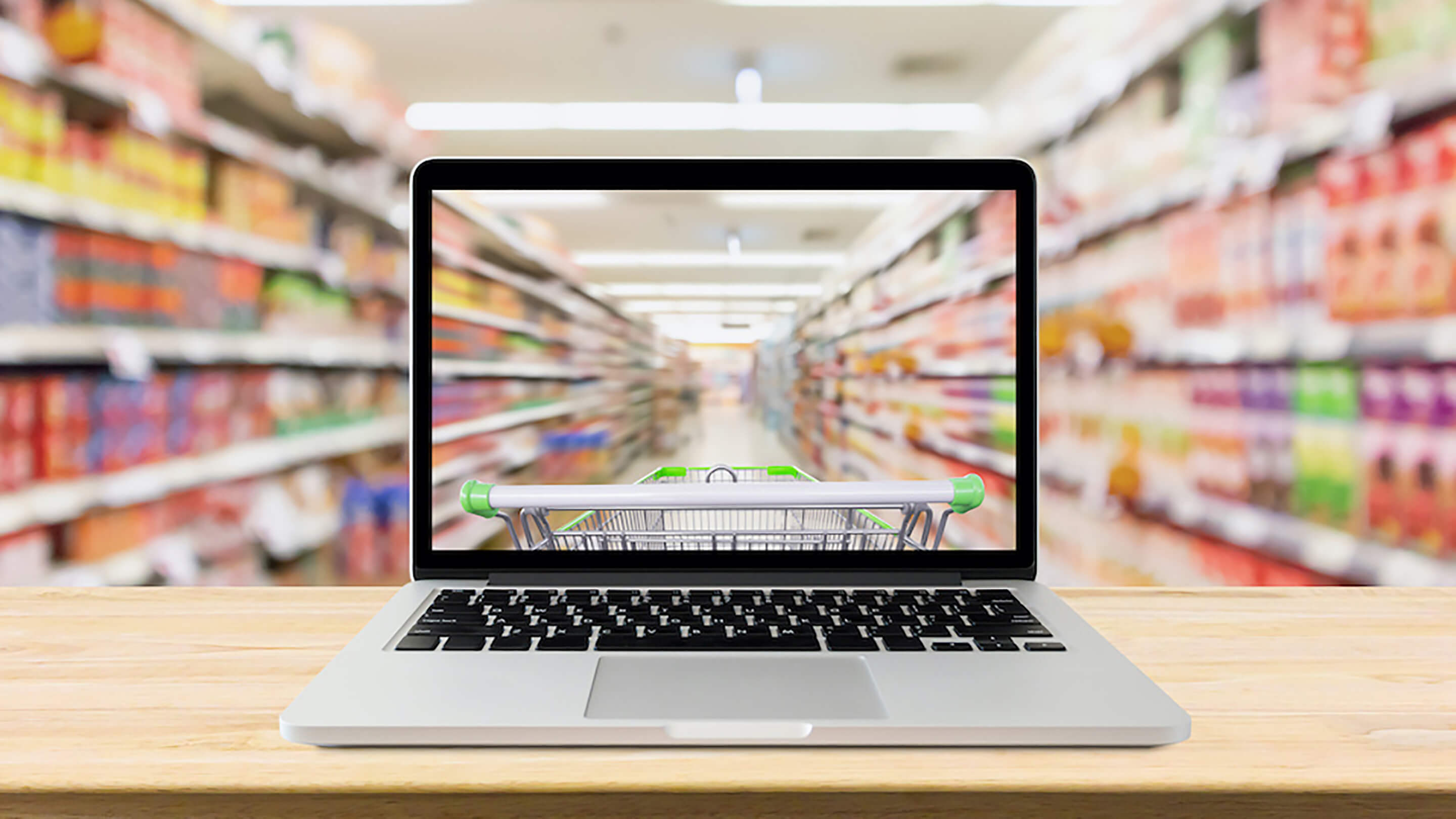
Packaging design requirements for online sales differ from what’s needed to make them stand out on supermarket shelves. The Grocer spoke to a range of brand experts, digital designers and packaging gurus, including our Managing Partner, Jen Ives to find out the most important elements of standing out on an online shelf. Here are their top tips for success..
Standing out on the online shelf has never been more critical to a product’s success. As online grocery’s share hovers steadily around 13%, it’s a channel designers can’t afford to ignore.
But the online grocery arena has very different design requirements from physical shelves. Getting an initial listing in the online space may be easier, but the wide range of choice only makes standing out harder.
Plus, designs must capture the attention of shoppers swiftly scrolling through their options, rather than browsing the aisles. Often that’s on a tiny phone screen that doesn’t leave much room for creativity.
“How best to convey your brand’s story and authenticity in the confines of a 2.5cm digital square? It’s a real challenge for designers – a torture test,” says Jos Harrison, global head of brand experience and design at Reckitt.
But there are some tricks of the trade that allow products to break through the glass display and find their way into the all-important shoppers’ favourite lists.
These include everything from adopting a ‘less is more’ design, to utilising tools such as dedicated product pages and positive customer reviews.
Less is more
“It’s definitely a ‘less is more’ situation,” says Lois Blackhurst, executive creative director at STB Graphic Designers, which has worked with Morrisons, Safeway and Fox’s. “The online packs need a lot less information on them, but that information needs to work an awful lot harder,” she says.
“A brand must have the confidence to ‘strip it right back’ and use three or four recognisable design elements to deliver the personality that the brand is known for. Scrolling on a screen, especially if it’s on a small phone screen, doesn’t give the image much time to have any impact, so the design really needs to deliver something special. My advice for brands thinking about redesigning their packaging would be that if you think the pack design is finished, you should try and take one more element off! Confidence is key.”
Tim Bousfield, group creative director at creative agency Path, which has worked with M&M’s, Lavazza, Noodl Plus, Oppo, Peroni and Red Bull, says brands must “express themselves clearly and unequivocally”.
“Without the laurels of the real-world fixture to rest on, elegant and succinct brand expressions are crucial,” he adds.
Jen Ives, managing partner at Coley Porter Bell, agrees: “Simplicity – on the online shelf, product visuals are tiny and hard to read.”
Creating a simplified version means greater cut-through, says Luca Cicero, art director at food and drink marketing and design agency Jellybean, which has worked with Nutella, Chicago Town pizza, Sarson’s and Porky Whites.
“Dwell time on online shops is low and so you only have a limited time to grab the shopper’s attention,” he explains. “Consider creating a simplified version of your normal packaging so that key elements of the design are not lost amongst the finer details. Ensure type is clear and set at a reasonable size, and use graphics to communicate the product’s key features and benefits so that you are not solely reliant on text to communicate what the product is.”
Emphasise the main selling points
“The key objective has to be impact,” says Tom Primrose, branding strategist at Curious London, who worked on the branding campaign for AB InBev’s Leffe beer. “With such a short window of time to connect and such a small space to play with – often a phone, tablet or laptop – it’s crucial that the design disrupts the consumer in some way. It’s important to make your product look unique, so try and prioritise elements of the packaging that consumers will either recognise or that will grab their attention.
Stuart Lang, founder and creative director of branding and digital agency We Launch, which has worked with GSK and mixer brand Lixir Drinks, adds: “Cut-through on the shelf has always been one of the biggest challenges for brands. The expression ‘don’t judge a book by its cover’ holds no water here. What customers see, compared to those around them, is of the utmost importance, especially in a world where products are no longer lingering in view as they fly by on the screen of your smartphone. With such little space for brands to operate in, knowing how to optimise their strongest visual attributes will make and break with digital consumers.”
“These visual elements are crucial for brands, says Primrose at Curious. “For established brands it draws in consumers that are familiar. Whilst for new brands, strong visual assets provide an opportunity for them to differentiate themselves from what else is in the market.”
Colours, patterns and logos matter even more
Cicero emphasises the importance of colour. “Strong colours in packaging not only create contrast, but also add drama,” he says. “Where colour is used to differentiate multiple products in a range, and where those products are seen together on a product page, they reinforce the breadth of the range as well as give an indication as to the different flavours and varieties that brand offers.”
Utilise product pages to the max
When an item is clicked from the main shopping screen of online grocers, shoppers are taken to a dedicated product page for the item.
“This is where you can have a little bit more flex as a brand and start to call on other areas such as your reputation with consumers, as well as product imagery which is more evocative. Linking in positive product reviews can help establish trust and authenticity, whilst a diverse selection of imagery can bring the brand to life and showcase products such as beauty brands in use,” says Primrose at Curious.
The pages are “vital to the shopping experience” adds Jellybean’s Cicero. “Your product page is your chance to apply every design, branding and sales trick in the book in order to convince the shopper that this product is for them. Care should be given to ensure that your product’s reason to exist is addressed including why it’s better than the competitor products, why it’s loved by consumers and why it should be bought,” he explains.
“Also great imagery, motion, video and maybe even audio, will help answer their key questions and guide shoppers to take action,” he adds.
They are particularly important for premium products.
“Online grocery shopping is a lot less engaging than shopping the physical aisle, and it’s a price-driven operation,” says Ives. “However, if you’re selling a premium product with more emotional engagement, in the absence of consumers being able to hold and feel it in their hands, product pages can be a great way to share the brand experience.”
Include shopper reviews
“Utilising verified Trustpilot reviews to point people towards your products is a crucial part of building an online presence,” says Steph Morris, head of marketing at Jimmy’s, the packaging of which went through a major rebrand early last year. “We try to integrate Trustpilot wherever possible to our social media campaigns and DTC listings and ensure that we reply to every review left. This not only helps guide consumers to purchase, it also contributes to SEO and drives traffic to your online listings.”
Pick your words carefully
“Making sure to include the right information and key words on product pages is likely to bump products higher up the list, which could itself be 20 pages long,” says Mark Croxton, VP customer support at Symphony RetailAI. “Consumers probably won’t scroll beyond the first few product pages, so getting to the top tier of the list is crucial.”
Using the right key words “will help to push brands further up the list and ensure they don’t get lost” he adds.
Product data has “become as important an asset as physical package label information,” says Jessica Chapplow, head of e-commerce at Havas Market, which works with Pernod Ricard and Dettol.
“A shopper cannot discover your products if they aren’t coded for every relevant search term, so the right key word set is critical to getting your product noticed and meeting revenue targets,” she adds.
Not only do product detail pages help shoppers, “some retailers use optimised PDPs as part of their search algorithms, ensuring products feature higher in search rankings,” says Callum Saunders, head of planning at fmcg brand activation agency Zeal Creative, which has worked with Nestlé, Kellogg’s and Imperial Leather.
“While Ocado’s rebrand needed to be digital first, everything we did needed to look as good online as it did in your hand,” says JKR creative director Martin Francis. “We were very interested in the idea of being ‘shelf proud’. It had to look good in digital form, but it had to look amazing at home.”
Given the online format, the priority was “simplification and amplification” of branding, colour palettes and product information.
“As the consumer will only ever purchase these products online, bold simplicity and distinctive illustration was a key factor from the very start to distinguish from competitors in the online experience,” Francis says.
“The pack in the hand will of course have nuances from their online visual – scaled down type, romanced copy, GDAs – but the difference will be less apparent than other branded packaging, which may have been created initially with the physical shelf as a starting point,” he adds.
Appealing online packaging “inevitably means sacrificing some elements” Francis says. Things like “subtle textures, finishes and detailed patterns add value in the hands of the consumer at shelf but will often be lost in the digital environment and could just be adding unnecessary noise and confusion to the pack as it appears online” he adds. “Food photography which delivers appetite appeal at shelf will often play a lesser role.”
“One of the key ways in which we’ve built online category presence is by always using our own approved product photos across all online platforms,” says Morris at Jimmy’s. “This has allowed us to consistently have crisp, top-quality imaging that really showcases the reason to buy. For example, as our iced coffees are best consumed ice cold, we photograph them with condensation beads to give the consumer that impression of a refreshing taste experience.”
Take ownership of imagery
It’s also important to test visuals on a variety of screen types, says Grudzinski. “Graphics that look great on a 14-inch-tall breakfast cereal box on a grocer’s shelf will get lost when reduced to an image that’s a half-inch tall on a phone screen,” he notes.
Tap the power of symbolism
“It’s about imbuing relevant meaning at a brand identity level and the quickest and easiest way to do that is through symbolism. By creating intentional associations through symbolism – in other words – generating visual metaphorical shortcuts in consumer’s minds, you create connections,” says Ellen Munro, creative director of BrandOpus, which has worked with Princes and Rustlers.
“Visual triggers and quirks also create memorability,” she adds.
As Path’s Bousfield puts it: “Create a visual system that is recognisable on screen and on-shelf. Make customers feel like they know the brand, even if they don’t.”

